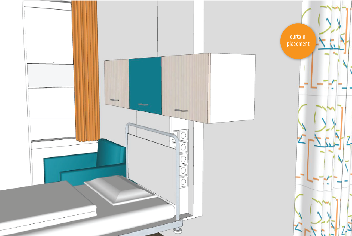
Prinses Maxima Centrum - cubicle curtains
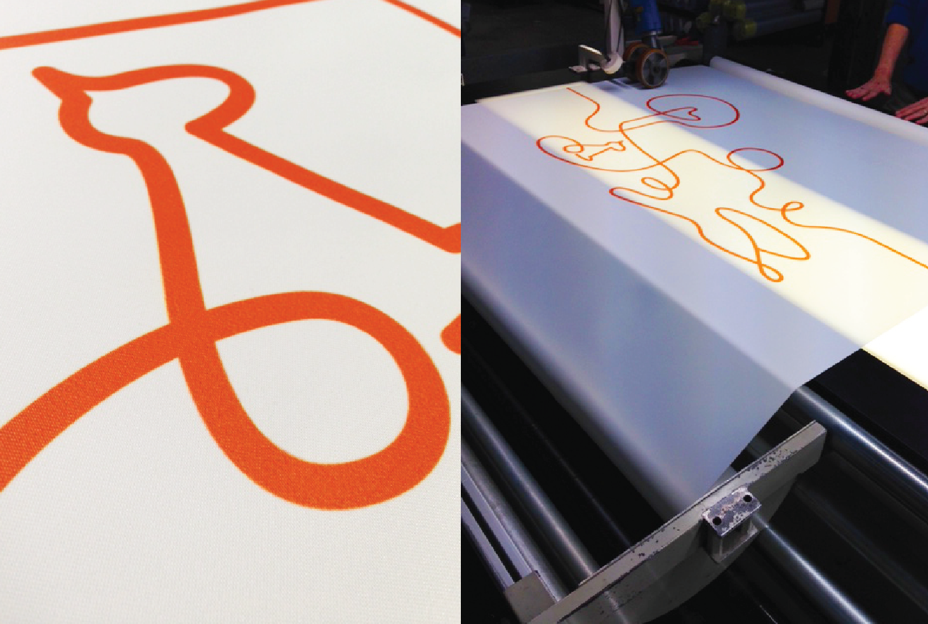
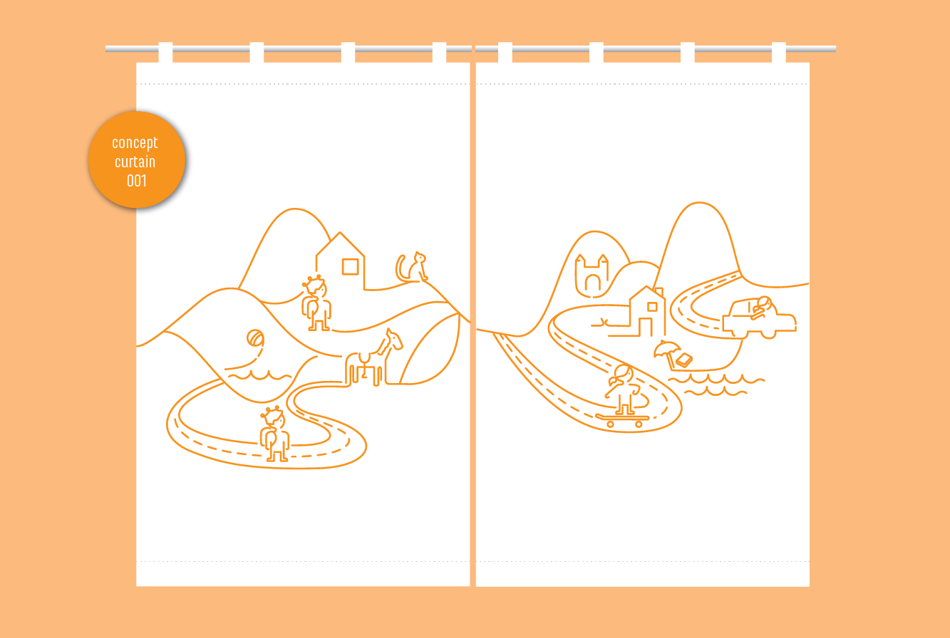
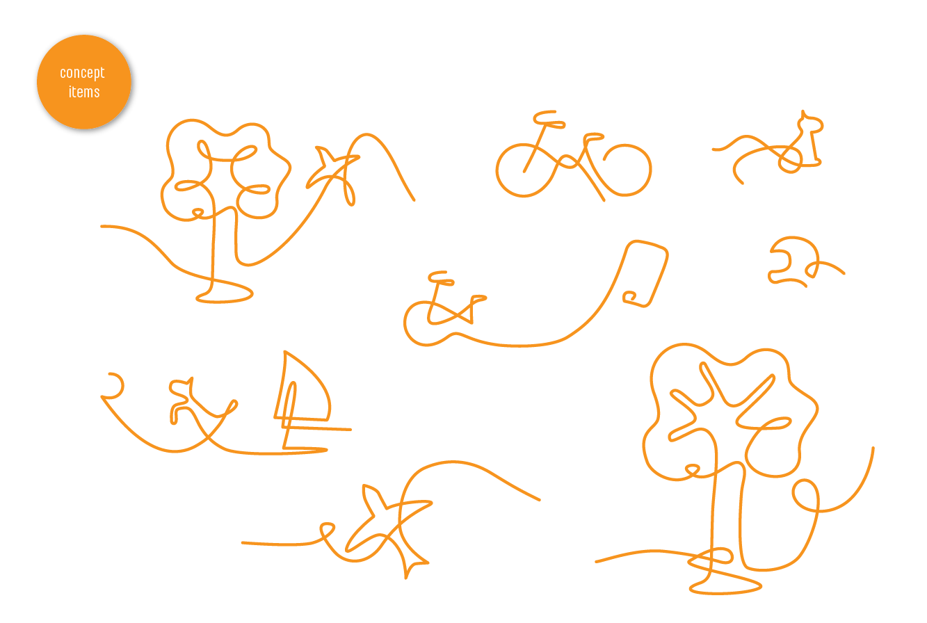
The visual identity for the Prinses Maxima Centrum was made by Kiki Hartman in collaboration with BrandBeing. The crown symbol in the Maxima shield is drawn using one singular orange line. The line connects and unites (people) and has a child-like hand drawn quality to it. This orange line will become a distinct and recognizable visual element throughout all the Prinses Maxima touch points. The curtain project was the first touchpoint where the line would make a whole illustration.
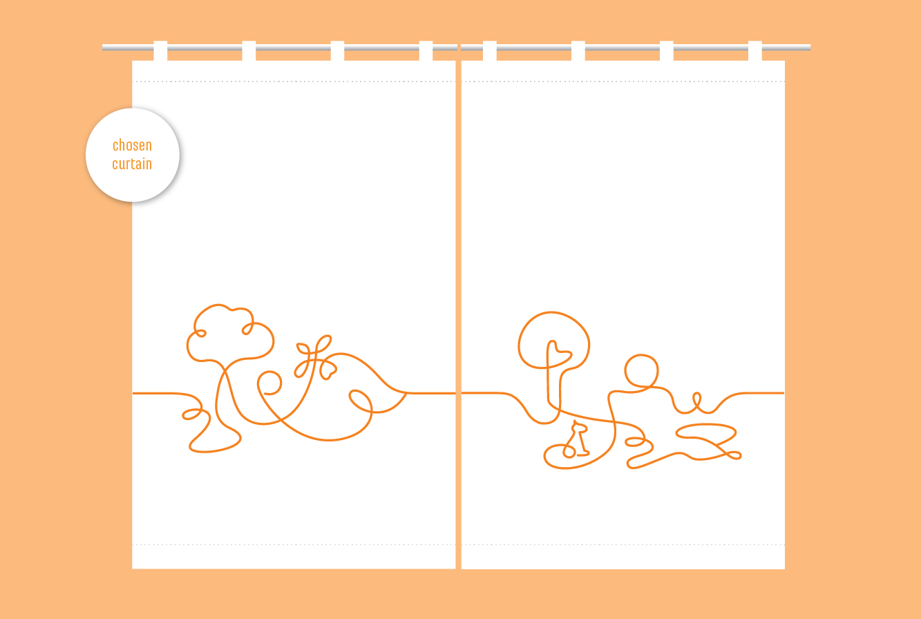
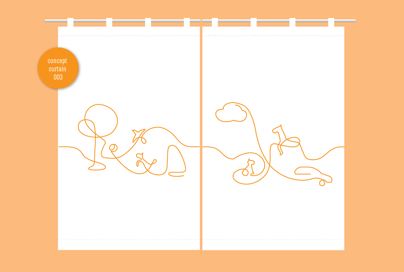
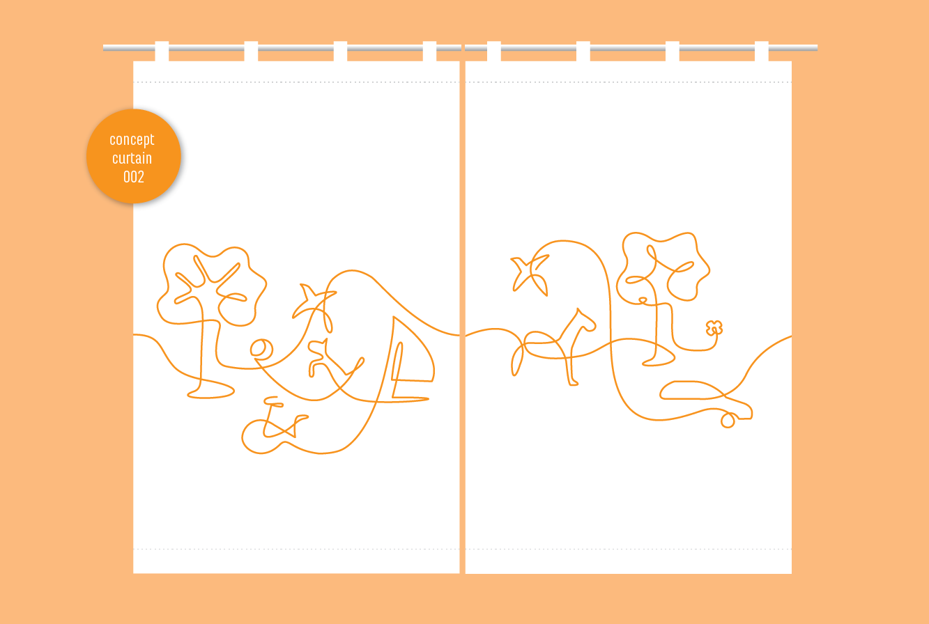
The illustrations I made on the curtains became very abstract forms in which you could see multiple depictions. One child will see a cloud another will see a tree in it, but the main thing in this illustration is the line goes forward and makes all the illustration in a continous flow. The style for the illustrations was a search in how abstract we should go on these curtains without being too childlike or too abstract. By now these illustrations mhas set the style for all other applications, like brochures and website.
Brand strategy - Kiki Hartmann & BrandBeing
Design - Laura den Otter
Supplier - Artimo Textiles
Material - Porvo CS satin